Every year, Chelsea in Bloom transforms the streets of West London into a temporary outdoor gallery where fashion houses, hotels, restaurants and luxury retailers compete to create the most visually striking floral installation. Some brands lean playful, some go theatrical and others attempt to build social media moments through scale alone, but the installations that usually resonate most are the ones that still feel connected to the identity of the brand behind them. Cartier understood that balance perfectly this year.
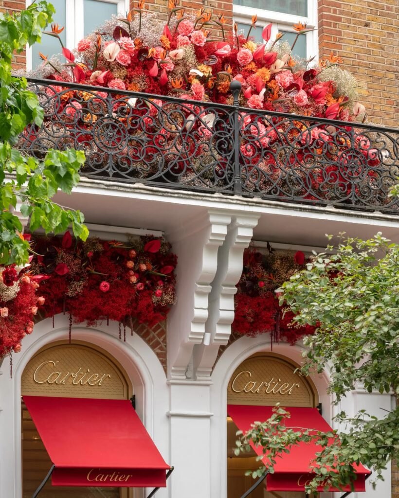
Created by John Carter and his team at John Carter Flowers, Cartier’s boutique facade became one of the standout moments of Chelsea in Bloom 2025. The exterior of the Sloane Street boutique was transformed with an enormous arrangement of crimson florals, blush toned baby’s breath, cascading textures and sculptural tropical stems layered dramatically across balconies, windows and entrances. Despite the scale of the installation, the boutique itself never disappeared beneath the flowers. In fact, the architecture became even more striking because of them.
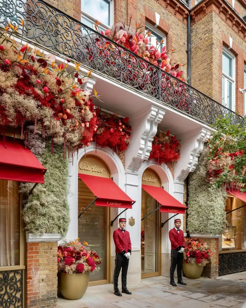
That balance is what elevated the installation beyond decorative floral styling. The signature Cartier red awnings anchored the entire composition visually, creating a strong contrast against the softness and movement of the flowers surrounding them. Gold logo detailing, cream stonework and ornate black iron balconies all remained visible within the installation, allowing the boutique to still feel unmistakably Cartier while embracing the theatricality Chelsea in Bloom encourages each year.
A lot of luxury storefront activations currently fall into the trap of becoming visually overwhelming. Brands often chase scale or virality to the point where the environment loses any real sense of identity, but Cartier’s installation felt incredibly considered in the way it translated the house’s existing visual language into florals. The rich reds reflected the brand’s heritage colour palette immediately, while the softer pinks, creams and natural textures introduced warmth and softness without compromising the sophistication associated with Cartier.
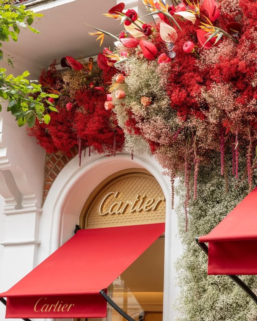
The installation also worked particularly well because it understood how people experience luxury retail today. Increasingly, storefronts are no longer simply entrances into stores. They have become content destinations, tourist attractions and cultural moments in their own right. People travel specifically to see these facades, photograph them and share them online, especially during activations like Chelsea in Bloom where the streets themselves become part of the experience. Cartier leaned fully into that behaviour while still maintaining an atmosphere that felt elevated rather than performative.
What John Carter Flowers consistently does well is create installations that feel immersive without becoming chaotic. There is always structure beneath the abundance. Even within the density of the florals, the arrangement still felt architectural and intentional, almost as though the flowers were naturally growing around the building rather than simply attached to it for effect. That approach allowed the installation to feel luxurious rather than excessive.
There is also something particularly interesting about the relationship between florals and luxury retail right now. Flowers have always existed within luxury spaces, but increasingly they are being used less as decoration and more as a branding tool capable of transforming entire environments emotionally. At Chelsea in Bloom especially, florals become part of storytelling, helping brands communicate romance, craftsmanship, heritage and fantasy through texture, colour and scale alone. Cartier’s installation managed to capture all of those qualities while still feeling modern enough to dominate social feeds instantly.
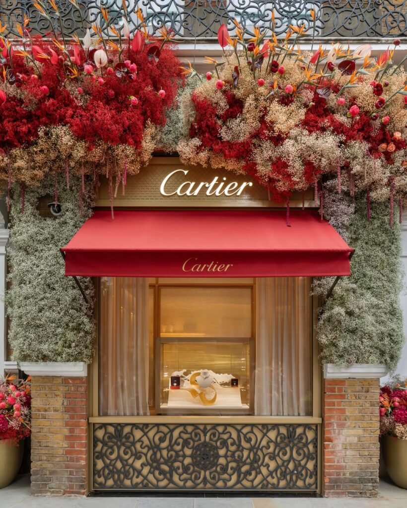
The surrounding Chelsea streets undoubtedly contributed to the atmosphere as well. During Chelsea in Bloom, the neighbourhood takes on an almost cinematic quality where boutiques, cafés and hotels become layered within a wider floral landscape across the district. Cartier’s storefront, however, carried a level of visual confidence that made it stand apart even within that environment. The installation felt rich, dramatic and unmistakably luxurious without needing gimmicks or overly literal storytelling devices.
What made the facade particularly memorable was how emotionally transportive it felt in person. The scale of the florals spilling over balconies and framing the storefront created an environment that encouraged people to pause rather than simply pass through the street. In a retail landscape where attention spans are increasingly short and physical stores are constantly competing against digital convenience, creating a storefront capable of stopping people entirely is becoming more valuable than ever.
Cartier and John Carter Flowers achieved exactly that.